Last week we finally published a review of Meizu MX4. We liked the unit itself, we are glad that you liked the review, so it’s time to tell you about one of the many pleasant sides of the unit – the firmware. Flyme OS 4.0.4. successfully combines brevity and simplicity of iOS and diversity and fussiness any other Chinese firmware, a kind of product at the intersection of iOS and Android. But with a couple of useful tricks. Here’s talk about them under the cut.
Say at once – with previous versions of the firmware, I know only by pictures, so that the review will be a series of “fell in love at first sight.” If you have the opportunity to compare with earlier versions you something not satisfied or can draw a parallel – Welkom in the comments, there is everything and discuss.
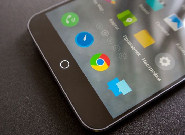
I purposely dropped a shell item in the survey because of flyme os can talk a lot. Let’s start with the obvious – the button. This, though not part of the firmware, but without any explanation of its main features the whole system not imagine. In contrast to all other Android-smartphone, which three control buttons (with a few exceptions – some have two), it does not matter – they are virtual or touch, but they are still three in the bulk devices, this device one button, and touch it. Kruglyashok is at the center of the screen. He fluorescent and glow in the dark. In addition to their direct duties, he still serves as a sensor notifications. With it, you can go to the main menu. This button “Home” – A short press. A long press (about a couple of seconds) – a device lock. And if you hold the button up – you go back. Nothing complicated, remember easily.
If you are missing some buttons “Back” and “Context menu”, has a smart bar. It appears this (not always), the band extra buttons. In fact, it is more a hindrance than help, because it brings additional functionality only preset programs, and in all the other eats just to win a part of the display. Therefore, in setting provides the function to hide the smart bar unnecessary. Here are a couple of screenshots of the application where the smart bar really need. That is, it displays all the “buttons” that otherwise would have somewhere to hide “a cat”, complicating the system.
Menu with the latest running applications can be opened by pulling on the main screen is unlocked from the bottom face up. Applications are removed one by one, or swipe up or swipe down all together, cleaning RAM. Long retention block the application icons.
The first thing that caught my attention in Flyme OS, – it supports multiple gestures. And if Color OS on my Oppo Find 5 million and they had zamorochitsya to remember them all, everything is simple:
At first I put Twitter and happy as now everything quickly and at your fingertips, BUT! If you are an active user tips from Google, remember that the swipe of a menu button Google does not cause it mehanichekoe movement, sewn into the firmware is already interesting, so I set this svayp Google Now. I like the cards, they are useful. The result was a full-fledged Android KitKat. You can always go into the settings and change the application. Them to choose from there are a million. From preset to those that you yourself in Play Market rocked. Even games can be. In general, everything.
I specify! Out of the box on my particular device was not installed any one Google service. But the store directly on the home screen, so it’s all done quickly.
You can install on your smartphone remedies, such as a password, which will contain letters and numbers, or PIN. It is possible to set passwords for opening specific applications. Guest Login is also present. A set of applications for this mode choose yourself.
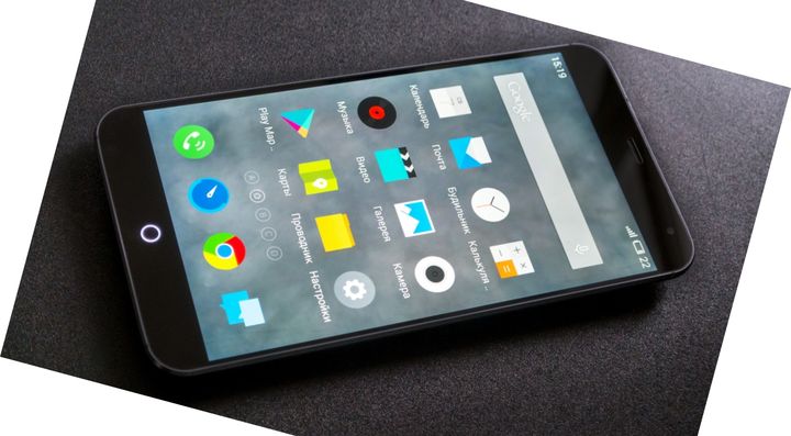
Unlocked – and came into the world Flyme OS. The main pillars of the firmware: personalization, security and seals. The exterior looks like iOS. Still have not passed even times when the firmware without the application menu still compares it with her. And the settings menu with icons accompanying inscriptions which are drawn only after a swipe to the left. Everything is stored on the desktop may collect application folder is present, the number of applications in them, as I understand, is not restricted, and the maximum number of desktops – nine. Tables are scrolled horizontally inside the folder management – vertical. You can install widgets, home desktop is set in two clicks, designated house, all other individually signed letters of the Latin alphabet. The bottom tray is placed four shortcut or folder. The new application takes space on the last desktop. Application shortcuts are placed in the grid 4 on 4. In the control desk there is an item “Settings”, which allows you to align icons on the top or bottom edge. If you decide to remove a shortcut from the desktop, you are prompted to delete the entire program.
Notification translucent curtain. It is possible to edit it. Initially, you see five shortcuts to open the other must be done swipe down.
I read that in Flyme OS has sewn voice assistant, but whether he is still exclusively for the Chinese market, then I just have not found it, but was looking for. But as he says still only in Chinese – do not worry, you will still enjoy it will not (unless you like Vatralik pessimist or for any other reason to learn Chinese). Charms and the need to voice assistants we have discussed here, so that today we will not. But there is a search, it does take on any desktop to make the move from top to bottom.
Enjoy the simple elements such as firmware dialer does not have time. Drew the attention of the item “Personalization”. Here, as in any other huge Chinese store in hell break a leg, you can wander up to the gray sideburns. But beware – themes can be more interesting or cute than simple and useful. The very first shell, which I liked, was completely wild icons on which it was impossible to understand what kind of application in front of us. And dialer in which figures are shifted and it was easy to make a mistake in the room. And the message is not displayed on top of the screen is locked, and something like that. Therefore, there are separate modules, “wallpaper”, “Icons”, “Desktop”, “Calls”, “Messages”. All this can be configured as you like, and so create a unique image of the shell.

And on the first screenshot shows the trouble shell – adaptation. It is good that Flyme 4 already supports 25 languages, Russian and Ukrainian including, but sometimes you wonder how all the “nice” happened. Hanging letters beyond the icons … as metal or foam glass.
An opportunity that can boast not many smartphones – a record of all calls. This function is disabled by default, so be sure to include it in the settings.
With it, you can quickly clear the smart really unnecessary things from clogging the memory, to find large files that take up the ROM, quick clean of applications that do not use for a long time, remove viruses, manage rights application in the menu “Permissions” and traffic in accordance menu, if your carrier has limitations.
A very useful feature – the additional memory. Each user is given a shell bezvozdmezdno cloud storage capacity of 100 GB. Do not forget that Meizu MX4 there is a variation on 16/32/64 GB without the support of microSD. Therefore, such a system to simply unrealistic steep. Who but the Chinese may well become generous? I register by mail or phone number – and use them.
In addition, the firmware stimulates creativity – has built risovalka. Functionality compared to the Samsung Note 4 lacks as SPen, but it is. Memo pad, voice recorder, weather – it’s little things. Built-conductor very comfortable with his side menu, where there are points “cloud”, “Disc”, “recent”, “Network Neighborhood” and many other labels. Very easy to manage. There is a useful guide that will explain how your working with the device. The right thing in our time – built-in calculator, currency converter, which can also reduce and keep on top of any window.
Trifle, but nice – while charging port on the screen fly “charges”. Do not have a suspicion that it is, but here are some details to the developers worked on the shell.
Still there are several features in the shell chamber, but they are aligned with the features done by MediaTek, so read more about them in the review and the camera menu. Battery menu has three power saving mode: “Performance”, “balanced”, “Energy Saving”.

From the fact that the shell did not like: the adaptation of language, and the menu for some reason the battery a couple of times disappears. Why is this, and have not understood, but were treated normal reboot. Still it is necessary to clarify that there are situations when the smartphone is not the first time to react to touch. I read that the problem is not unique, and it’s probably Fixed in new versions. And as a conclusion I would say that the company Meizu has already announced a firmware update Flyme 5, but the exact date of release did not mention. So we wait for it with a new super powerful flagship. A Flyme 4, which we have seen today, in honor can get the title of one of the most beautiful, concise, simple and functional as possible. This is an adult and a complete system with features which quickly get used to that and then did not have enough in stock Android (for the support I sign!). Flyme 4 really liked me and rightfully became one of the many obvious advantages Meizu MX4.
Read another very interesting article about alternative energy of the Sun, water and air.


