In the autumn of Apple and Google with an interval of two months released new version of mobile operating systems. As iOS and Android have influenced each other in many years of fierce competition? What are the two largest chip corporations openly borrowed from each other? How will the major mobile operating systems in the near future? Raqwe answers the most important questions about the updated iOS and Android.
Prehistory
Both Apple and Google update their systems in June. Of course, the more repercussions iOS 8 functions Continuity and Handoff, support for widgets, a new design standard messenger and announcing that it is now in the App Store will appear side of the keyboard.
Conference Google I / O
It was obvious changes between Android 4.4 KitKat and Android 5.0 Lollipop (Android L, as it was called at first) is much larger than that between iOS 7 and iOS 8: for example, more spring of 2014, rumors about what Google is actively promotes a uniform flat design.
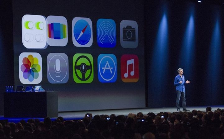
Apple WWDC Conference
Home Apple revolution took place in 2013: users quickly adopted the seventh version of iOS, and now the iPhone with iOS 6 on board seems an anachronism. Such a smooth transition (especially given the dramatic changes in iOS 7) Google can only dream of.
An illustrative example – an update to Android 5.0, has turned into outright tent. First, the release date for the Nexus family a couple of times transferred (not as GTA V for the PC, but also frustrating).
Secondly, the first update only the device without the SIM-cards – are having problems with the software. And only after permission of the many nuances began a massive change in the KitKat Lollipop. As a result, the share of Android 5.0, compared with a share of iOS 8 (a one-time update of all the gadgets in September) looks truly negligible.
Of course, the leaders of 2015 will come with a new Android, but it is not much impact on the current picture.
Recent trends
Notice on the locked screen
Android fans a couple of years outraged that Apple copied the best features of the operating system from Google: As a rule, such claims accompanied by a mention of Steve Jobs, without which the company “is not the same.” At the end of 2014, users iOS came back argument in Android 5.0 lock the screen finally ceased to fulfill the role of monotonous hours.
New Lock Screen Android
Now under these clocks are located notifications that you can either view or open (for later reply to a message, for example). Naturally, Apple gestures are not repeated here: in iOS for any action with the notice provided swipe, then Android is useful for this purpose the double tap.
Widgets
The history of small labels with instant functionality extends more since 2009, when Samsung has launched a line of budget touchphone with dealer (calculators, weather forecasts and so on), works from the main screen. At the same time widgets to emerge as one of the main elements of Android: from early versions to stick to the screen a beautiful watch or decorate your desktop useful menu for quick on / off wireless modules. In iOS widgets work a little differently: it is logical because imagine the hours of occupying two rows of icons, in a well-thought-out design of Cupertino impossible.
Widgets in iOS
So, iOS-widgets are hidden in the menu notifications – where they are shown a list, and the functionality is given by the developer (one of the first Russian developer – the company which deals with applications for the site Sports.ru: in their widget from the result of a football match, you can go directly to the statistics) . On the one hand, the decision to hide the widgets in the top panel looks elegant. On the other – many users avoid this function while continuing to press the old conventional desktop icons.
Keyboards
The ability to install third-party Android keyboards trump remained exactly until 17 September 2014, when Apple gave the green light to developers of alternative keypad. So in the iPhone appeared Swype (set method without departing from the screen) and a set of characters that are opened after a long press. I must say that the boom in exotic keyboards went pretty quickly: users have played with a new application, make sure that the native keyboard familiar (which does not mean “convenient”, but still), and returned to her.
Side of the keyboard for iOS
In addition, in iOS 8 in the bottom row of characters appeared in microphone that supports dictation in Russian. However, this innovation is also fascinated owners of i-devices for long: the wave of tweets containing “I dictated this Tweet with iPhone” gone in just a few days after the release of iOS 8. In any case, Apple deserves warm words at least for the fact that users have given try and compare the feeling between the standard keyboard and its analogs.
Additional functionality multitasking
Multitasking iOS has been a sore point until the release of iOS 7, which add a horizontal “carousel”, which can be used to “kill” the program.
Multitask in Android
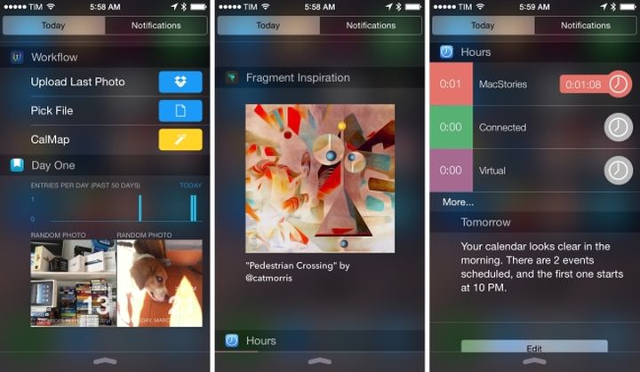
In iOS 8 free space to form the transition to multitasking, filled with icons of contacts: it is convenient for those who often calls on the same number.
Multitask in iOS
Judging by the menu change multitasking in Android, the idea of the original designers of Google thought the whole year. Alas, it turned out mediocre: layered on each other to examine the contents of the windows prevented. The reasons for this decision remain a mystery: no auxiliary functions is not here, except that now the program can be closed not only the traditional swipe, but also ordinary cross in the corner of the window.
Statistics Battery
Voracity Android-devices for a long time it was possible to monitor in detail: a special graph displays chronicle of energy expenditure, and formed below the list of the most demanding applications.
Statistics batteries in iOS
Apple has come to this only in 2014, if the user put before a fait accompli and allowed the minimum information (time in active mode / standby time), now appeared long list of programs sorted on the basis of the impact on the battery. Thus, it is much easier to figure out what percentage precious disappeared not because of the three-hour listening to an audiobook, but because of the uncovered Skype.
Health programs
Distribution of fitness bracelets and heart rate monitor (not to mention smart hours) has done its job: to iOS and Android lit embedded applications designed to record the daily activity of the user.
Appendix Google Fit
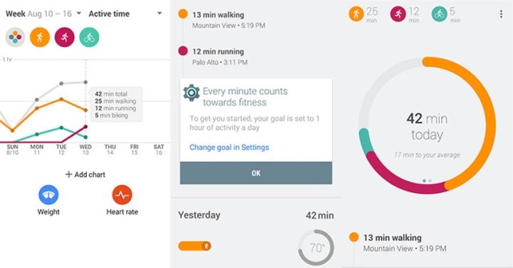
Health Apple’s simpler, clearer and more beautiful, but Google Fit clearly functional: they can set goals and indicate how specific activities engaged owner of the device.
Health app in iOS 8
In Health advanced open only with the advent of Apple Watch: it is planned that information extracted smart sensors hours will be instantly synchronized with the iPhone.
Advantages of Android and iOS
Despite the many similarities between the OS from Google and Apple, Android and iOS still have a number of key benefits to each other. Below we look at what the chips may be copied in the following versions of these systems.
Exclusive Android
Power Saving Mode
CPU frequency is reduced, smooth animation disappears, the background is orange – in power saving mode on Android Lollipop gadget can live for a few hours longer. Optionally option is activated, either manually or by reaching 15 percent, or if there will be only five percent. The smartphone starts to slow down a bit, but it’s hard to count on another outcome: power saving mode set in order to have time to make an important call. Alternative uses – the inclusion of this mode at night: calls will be held, and the amount of interest on the charge gauge virtually unchanged. This is an advantage over global airplane mode.
Power-saving mode in Android
In iOS anything like this is not provided: it was rumored that the answer for energy savings black and white, but later found out that it is aimed at people with visual impairments.
Guest mode
Sometimes the phrase “Wow, it’s a Nexus. Let me see, “I want to say no: who knows where he wants to go man, left alone with your smartphone. Thanks to guest mode (appeared in Lollipop) can not worry about privacy: it suffices to give the right to unauthorized users – where they can go, and where access is denied.
Guest mode in Android
On iOS hiding only applications which, however, easy to reappear after some manipulation of the menu.
Full NFC
NFC module was added to the iPhone only in conjunction with the announcement of the payment system Apple Pay: in fact, this chip works exclusively to pay for goods. NFC tap the full program can holders Android devices, which always know how many trips left on the card and the underground where are the keys (if they are programmed NFC-tag).
Search settings
In iOS superbly realized the search Spotlight, but it does not cover the setting in which to drown.
Search in Android settings
With Android Lollipop for the detection of any menu item will leave a few seconds: icon “magnifying glass” looks at the user’s upper right corner configuration section.
File Manager
In iOS implemented method Open-in: the application itself opens the file. In this guide (or similar) not as a class: the most favorable scenario, you will be prompted to choose a program that displays the document (or media file).
Astro File Manager on the Android
Finest hour comes Android: owners of gadgets running the Linux operating system (not only Lollipop) can delve into dozens of folders and download files without the program iTunes, which version for Windows PCs still leaves much to be desired (Mac users here shrugged).
Exclusive iOS
Clean the top panel
Any screenshot with Android-based device gives what applications use the host smartphone: they are usually crowded in the top panel. It looks like this is not very presentable, especially if space is not enough, and the system produces characteristic plus sign. Lack of accumulation in the mini-icons only one, but an important one: the more they are, the harder they navigate, so it’s easier to reset (clear) the top panel than to understand the notices.
At the same iOS interface element looks tidier at times: there will only include system icons, and notification sent either to the upper menu (the one that opens swipe), or to the application number (if you have two unread messages on Facebook, appears next to the messenger “2”; in Android is no such).
One menu
Some owners of Android-smartphone to work comfortably with two menus: the first is formed by the user on the screen, and the second is a complete list of downloadable and pre-installed software.
Menu in Android
Folders in the second menu you can not create, change labels in places – too. The easiest way to navigate the list of applications – sort them alphabetically.
In iOS with one screen all becomes much simpler: application automatically get to the end, you can rearrange them as you like, and folders are formed rather quickly.
Menu in iOS
By the way, Android vendors are gradually beginning to appreciate this approach: in the company Huawei launcher screens the number of workers is reduced to one.
Continuity and Handoff
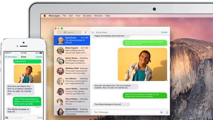
Laptop, candy bar, tablet, smartphone and player transformed into a single system that works as a whole. Start a note on the iPhone and finish – for MacBook; take up the challenge with iPod Touch; quickly create an access point to the computer immediately after the synchronization.
Mode Handoff between Apple devices
All of these scenarios are possible only on iOS: Android users for similar contingency will long remain a dream. Reason – 8 compatibility iOS and OS X Yosemite, which provides such an impressive interaction.
Separate browser
On Android, any link opens in a browser – most often in standard. It turns out that instead of tabs displayed smiley: this happens when the number of windows in Chrome over a hundred. Apart of regular jerks (RAM is not unlimited), the accumulation of tabs makes it difficult to navigate among them. On iOS, this problem was solved using a browser that is integrated into the application itself: opened, read and closed, forgotten.
Photographing credits
Another unique feature iOS – AutoComplete window into which you enter data cards. In Safari, is a function of photographing a recognition of numbers: enter anything do not have to after you click the shutter data themselves flooded in the right window.
Auto Detect credit in iOS
However, this option is meaningless for the paranoid.
Family Access
Function Family Sharing is designed for a large family (up to six people), which makes extensive use of gadgets from Apple: the participants will be able to send each other pictures or geo, edit calendar events and to share our content (principle: one bought, and all are). Before purchasing the application children will seek the approval of their parents – without their permission “adult” (or expensive) software and will be in the App Store.
Family Mode in iOS
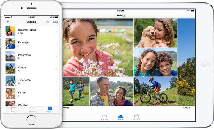
In the Android family access partially offset guest mode, but the opportunity to acquire software “at all” in the operating system from Google is not available.
Findings
Android Lollipop with its updated design theme (it is now lighter), useful features locked screen, and generally good ergonomics deserves a much larger share than it has now. Unfortunately, on the distribution of the fifth version of this system will leave a lot of time: not all gadgets with Android 4.4 will pull Lollipop with its flat interface and multiple chips.
As for iOS 8, it is all transparent: in summer Apple will release iOS 9 with few updates. According to preliminary data, it will be the same iOS 8, but more stable and smooth. Well, the easier it will get used. But with the transition to the new version, most users are not the oldest iPhone and iPad and does not have problems.
Read another very interesting article about alternative energy of the Sun, water and air.

